Creating a custom toast notification with Vue.js / JavaScript and HTML/CSS
This article assumes you have a Nuxt.js or Vue.js project set up and running.
This HTML/CSS toast uses 2 external libraries; TailwindCSS and Animate.css. Only Animate.css is required for the transition, but you could make the @keyframes
These are lightweight dependencies and not required. This tutorial does not use any annoying plugins with jank or large scripts / plugins. You can grab the CSS code from both the libraries yourself, if you just need the code for the toast notifications.
Install TailwindCSS
Nuxt.js
NPM
npm install -D @nuxtjs/tailwindcss tailwindcss@npm:@tailwindcss/postcss7-compat @tailwindcss/postcss7-compat postcss@^7 autoprefixer@^9
Yarn
yarn add -D @nuxtjs/tailwindcss tailwindcss@npm:@tailwindcss/postcss7-compat @tailwindcss/postcss7-compat postcss@^7 autoprefixer@^9
As of latest Nuxt.js versions, it might come with PostCSS 8 installed already. Check whether your current project uses PostCSS 8.
Additionally, add the dependency to your nuxt.config.js
// nuxt.config.js
export default {
  buildModules: ['@nuxtjs/tailwindcss'],
}
Add Animate.css
Add the following lines to your nuxt.config.js
// nuxt.config.js
head: {
  link: [
    {
      rel: 'stylesheet',
      type: 'text/css',
      href: 'https://cdnjs.cloudflare.com/ajax/libs/animate.css/4.1.0/animate.min.css',
    },
  ],
}
Be advised: This will add the script to every page on your website. If you only need transitions on a few pages, we recommend adding the dependency via layouts or page-level head()
Recommendation
We urge you to not include the CDN build, and just grab the animation you need by inlining your critical CSS. CSS is a render-blocking resource which will delay browser rendering and page execution. Therefore, we discourage adding an external resource with a HTTP request which has an average of 100-400 ms to respond. A lot of useless render-blocking time. Save time and space by inlining your critical animation CSS.
We use the CDN build now, because it is easier.
Creating the modal component
This modal component will be a string interpolated template for creating re-usable modals and toasts. String interpolation can be performed by passing props<ModalApp />
ModalApp.vue
<template>
  <div
    v-if="visible"
    class="fixed inset-0 inset-y-16 z-10 flex items-start justify-center px-4 py-6 pointer-events-none sm:p-6 md:hidden"
  >
    <div
      class="max-w-sm w-full bg-white shadow-xl rounded-xl pointer-events-auto ring-1 ring-black ring-opacity-5 overflow-hidden"
    >
      <div class="p-4">
        <div class="flex items-center">
          <div class="flex-shrink-0" @click="openLink">
            <img
              :src="icon"
              class="rounded-xl object-contain md:object-scale-down h-12"
            />
          </div>
          <div class="ml-4 w-0 flex-1 pt-0.5" @click="openLink">
            <p class="text-md font-bold text-black">
              {{ title }}
            </p>
            <p class="mt-1 text-sm text-gray-900">
              {{ subtitle }}
            </p>
          </div>
          <div class="ml-4 flex-shrink-0 flex">
            <button
              class="bg-white rounded-md inline-flex text-gray-500 hover:text-gray-600 focus:outline-none focus:ring-2 focus:ring-offset-2 focus:ring-black"
              @click="closeModal"
            >
              <span class="sr-only">Close</span>

              <IconCross class="h-5 w-5" />
            </button>
          </div>
        </div>
      </div>
    </div>
  </div>
</template>

<script>
export default {
  props: {
    icon: String,
    title: String,
    subtitle: String,
    link: String,
  },

  data() {
    return {
      visible: true,
    }
  },

  methods: {
    openLink() {
      window.open(this.link, '_blank')
    },

    closeModal() {
      this.visible = this.visible !== true
    },
  },
}
</script>
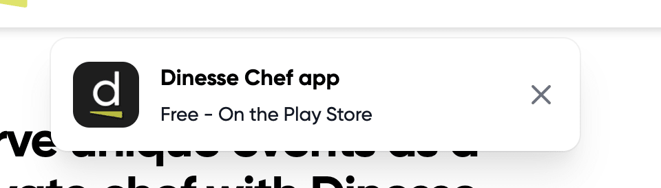
Show your modal
<template>
  <ModalApp
    v-if="__optional__ conditional templating"
    icon="__YOURICON__"
    title="__YOURTITLE__"
    subtitle="__YOURSUBTITLE__"
    link="__LINKTOGOTO__"
    class="animate__animated animate__slideInDown"
  />
</template>
Make sure your nuxt.config.js
// Auto import components (https://go.nuxtjs.dev/config-components)
components: true,
In our case, the following modal shows up: